Jacobs’ Masterbrand: Conceptual Work
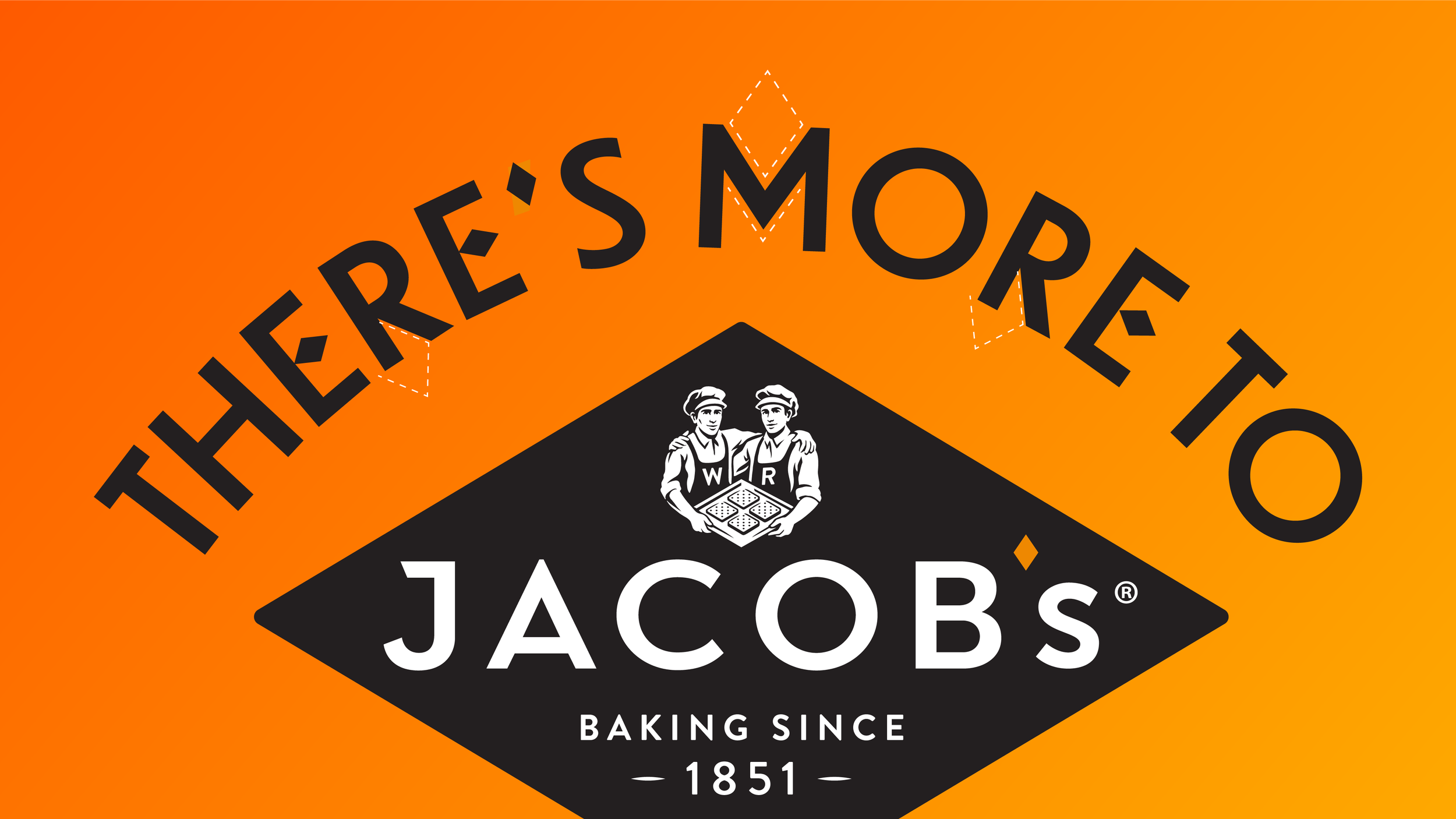
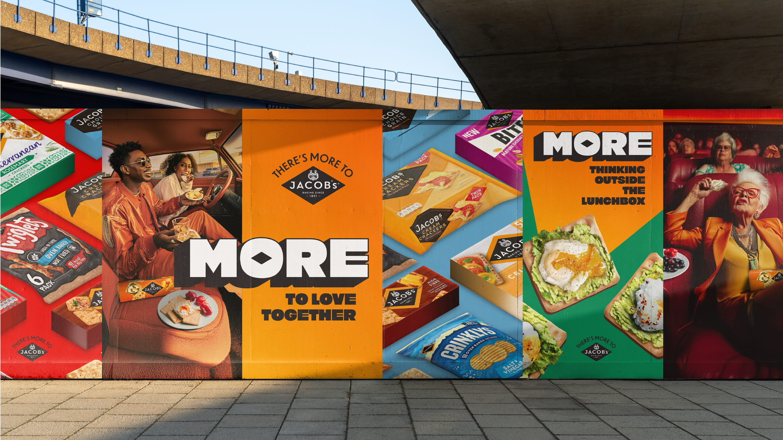
Jacobs is home to some of the UK’s most iconic snacks, yet the brand itself was often overshadowed by the products it contains. Our task was to reassert Jacobs as a confident masterbrand.
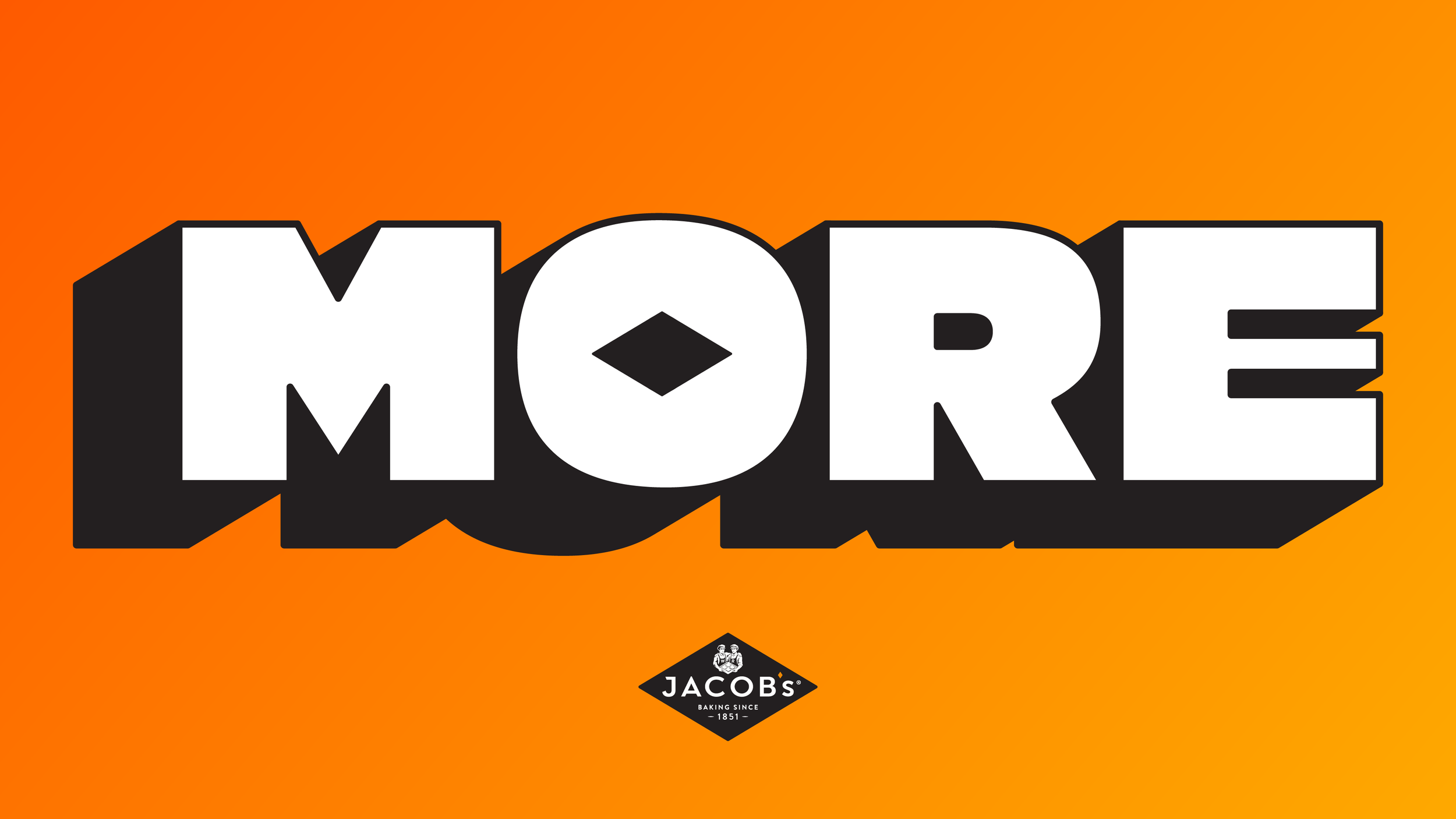
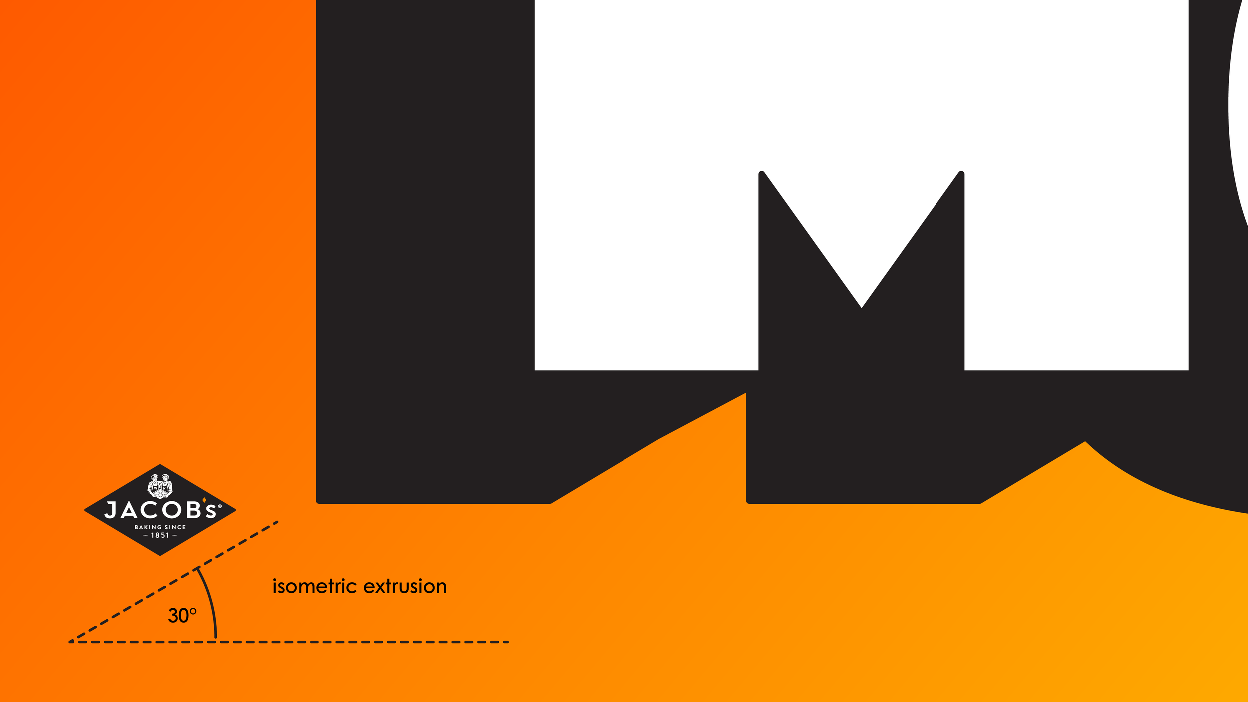
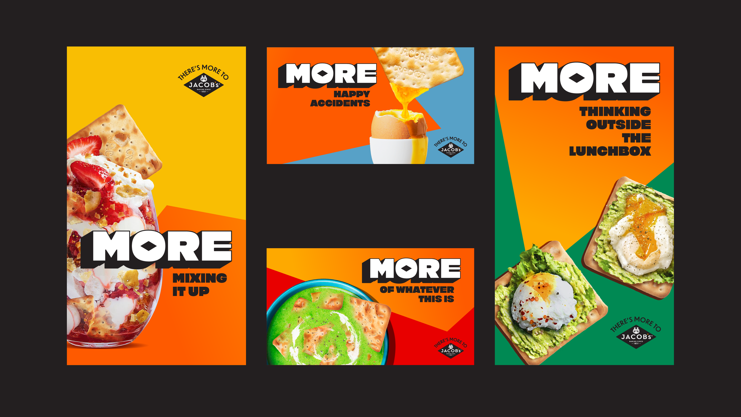
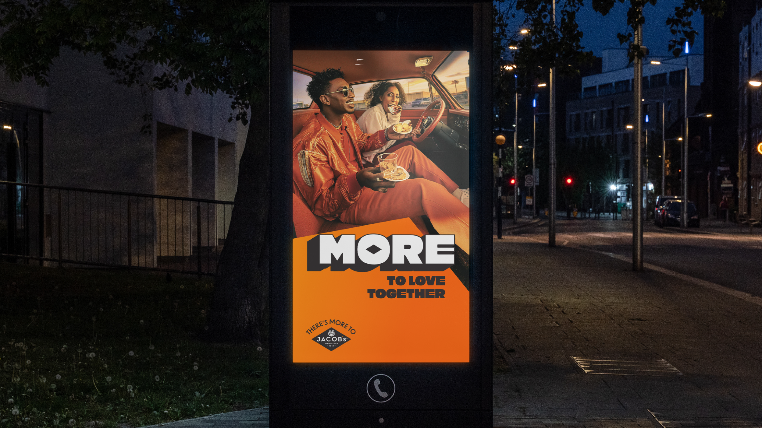
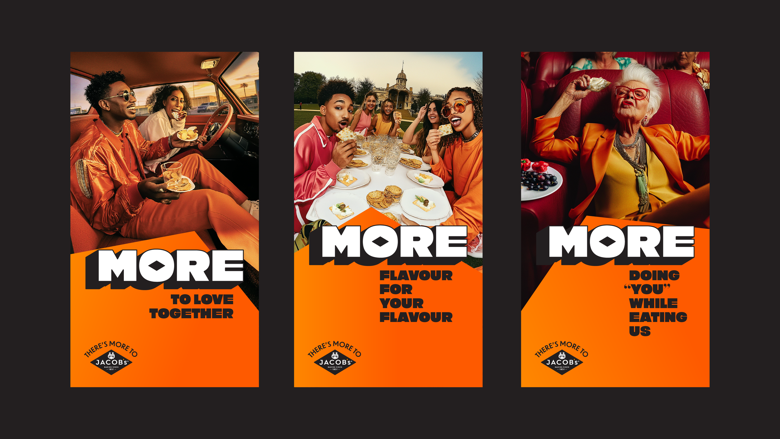
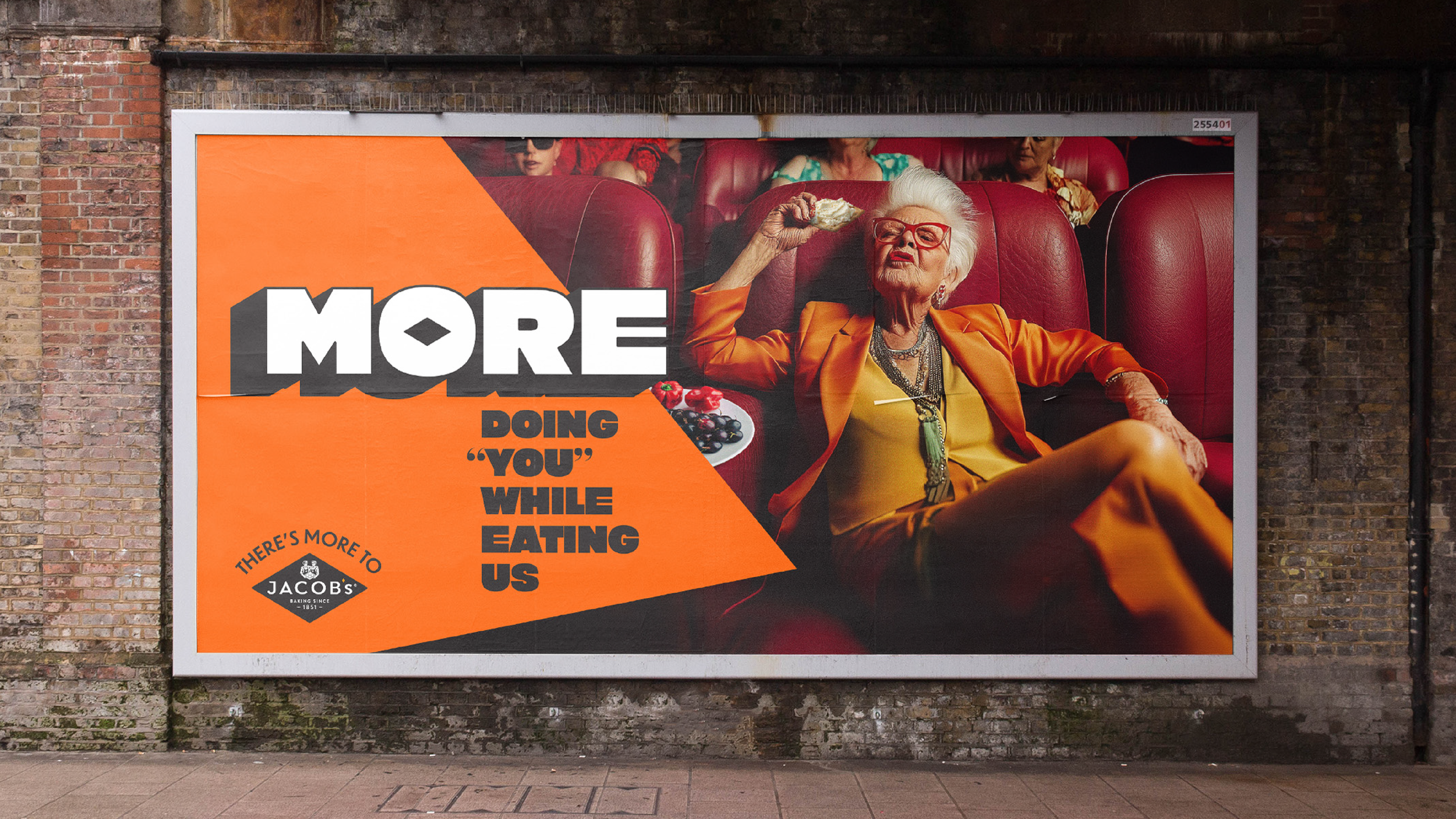
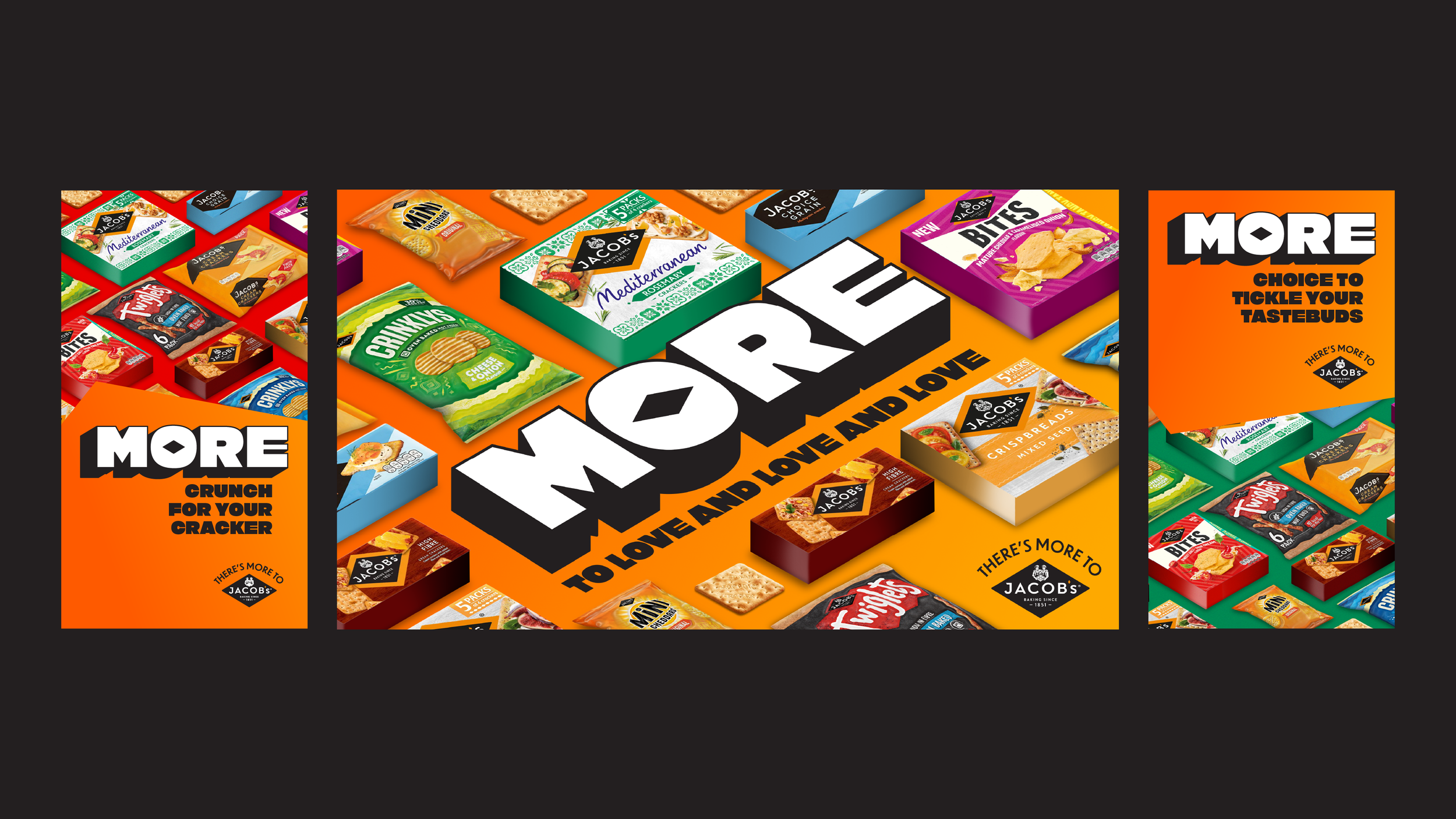
Using the isometric angles of the Jacobs diamond as our starting point, we built a bold 3D typographic system that brings clarity, depth and consistency across every touchpoint. Extruded hero messaging and graphic planes give the brand physical presence in the world, from OOH to packaging and retail.
The result is a distinctive, ownable system that unifies the Jacobs portfolio and gives the brand a voice as strong as the snacks it represents.